If you’re interested in making websites, you should learn about web accessibility. It’s very important because it’s considered a basic human right.
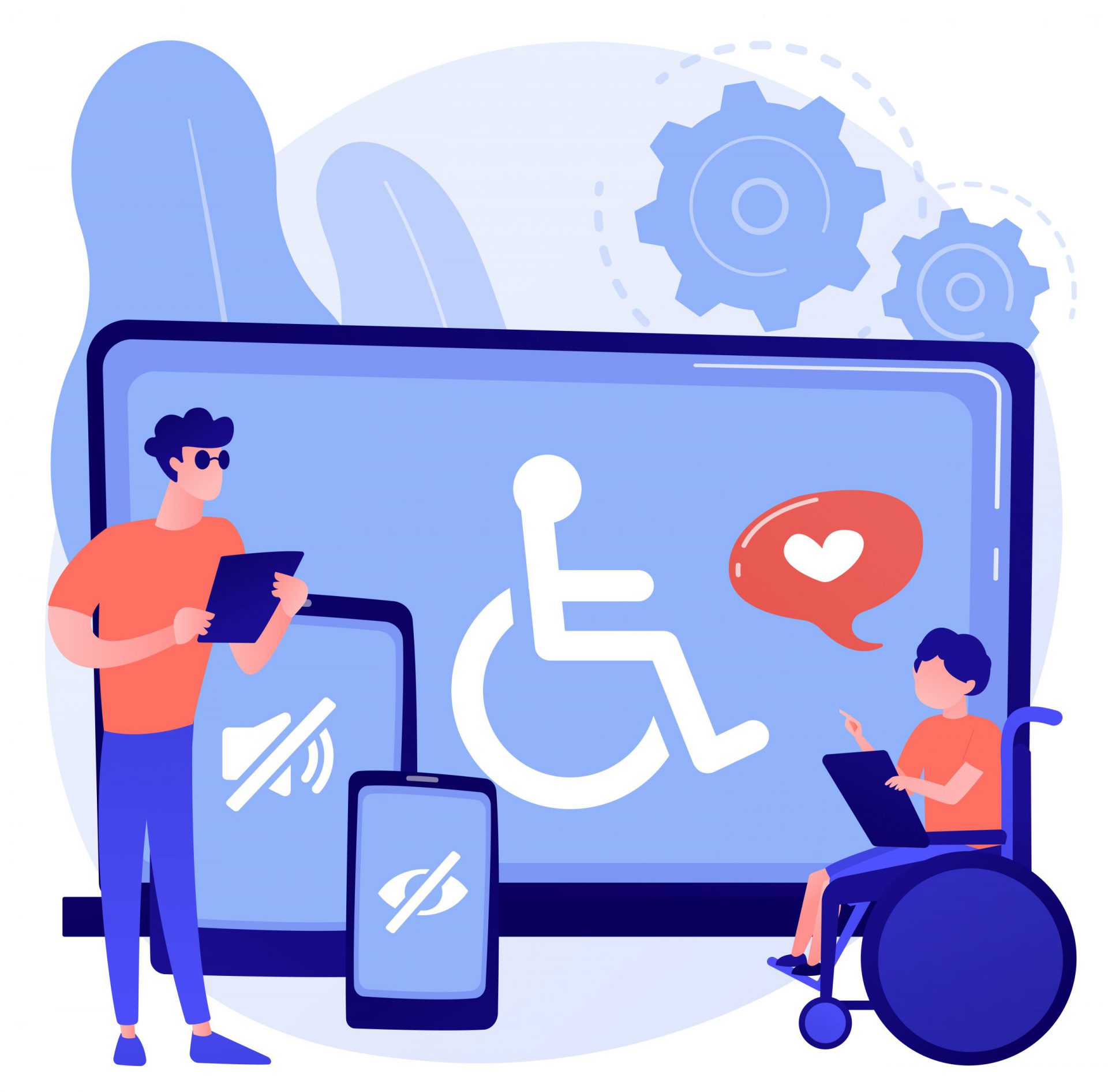
Web accessibility means ensuring the website can be viewed and understood by all users, taking into consideration those with disabilities such as visual impairment.
Users with disabilities may have trouble with the layout, font size, or content of the website and hence are unable to use it. In most cases, they need assistive technology such as screen readers to understand the content of the website.
The World Wide Web Consortium (W3C) developed the Web Content Accessibility Guidelines (WCAG) that web designers and developers need to follow when they build websites.
These guidelines are intended to ensure that people with disabilities have the same access to websites as everyone else.
Below is a checklist based on the WCAG that you may find useful to help check if you’ve built an accessible website. It’s categorized into different website elements such as web pages, images, and multimedia.
Let’s dive right in.
Web Accessibility Checklist
#1 WCAG 2.1 Checklist: Web Pages
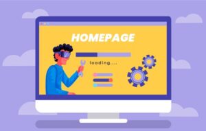
1.1 Each webpage has a different title
The title is important as it’s the first element that people will see when they come to the page.
Unique and concise page titles are key to helping users with visual disabilities easily understand what the page is about.
1.2 Ensure the background color and the text color have high contrast
If there is no high contrast, users with low vision may find it tough to read and understand the content.
This is especially important for users who use screen readers who need this contrast.
1.3 Use header tags for your content
Header tags help structure the content on the web page.
Screen readers use the tags to understand the content and present it properly to the user with disabilities.
They also help screen readers navigate easily through content so users can have a good experience.
1.4 Use formatted lists
Formatted lists provide access to web pages by making the content easier to read and understand.
They’re easy to scan and skim through, visually interesting, and compelling. Users will be attracted to the site and they’ll want to read what it’s all about.
1.5 Test your content with screen readers
Testing content with screen readers ensures your website meets the standards and guidelines required by WCAG.
This is to ensure all users including those with special needs can access, read and navigate the content on the website.
1.6 Use text labels instead of placeholders in form fields
Form fields such as dropdown menus, checkboxes, and radio buttons can become inaccessible when they’re left with placeholder text, even if the user can see the field.
Use text labels instead as they make it easy for users who use screen readers to read the information that you want them to fill out.
1.7 Font size should be a minimum of 16pt for desktop and 12pt for mobile
According to W3C (the World Wide Web Consortium), this is the recommended standard for the desktop version and mobile versions of the site for web accessibility.
If the font size is too small, there will be difficulty in reading the text.
Ensure the font size is appropriate for users with vision impairment to read.
#2 WCAG 2.1 Checklist: Images
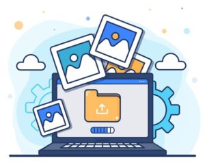
2.1 Ensure alt text is available for all images and should be between 60 to 140 characters
Alt text, or alternate text, is used to help visually impaired users understand your images and provide the information for them.
The text is meant as a replacement for the picture and tells the user what is inside the image.
It can be the name of the person in the picture or the description of it. Keep it to between 60 to 140 characters.
2.2 Reduce the use of text images
Text-only content is easier to read than an image with text next to it or too many images on the page. Text-only content is easier to translate into speech and played for visually impaired users.
The fewer images you use, the faster your web page will load. If you use more images, your users might find it difficult to navigate your website as they can be distracting.
2.3 Hide from the screen reader if the image is meaningless
Screen readers, such as VoiceOver, JAWS, and NVDA, are text-based browsers that navigate websites visually and can’t access images on a page.
If an image is meaningless and not helpful for users, you can hide it so the screen reader won’t read it.
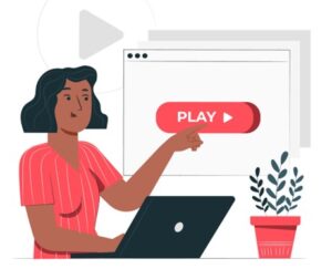
#3 WCAG 2.1 Checklist: Video & Media
3.1 Transcripts or captions should be available for all video content
Transcripts or captions ensure people who use screen readers and other assistive technology understand the information on the web page.
Videos are often an important part of the lives of people with disabilities who can’t read without audio. For them, captions are a great way to access important information.
3.2 Transcripts should be available for audio content
The same goes for audio content as for video content.
Transcripts help people with disabilities understand the content and access information.
3.3 Include a text description for all media
To make the website accessible for all users, text descriptions should be included to describe and explain the media.
This helps users with disabilities who use screen readers understand what the media is about.
3.4 Provide instructions on how to access the transcript
Transcripts are plain texts created from audio or video content. They provide users access to your content when they can’t get it from audio or video.
Clear instructions thus have to be provided to show them how to access the transcripts.
3.5 Ensure the media does not auto-play
Media autoplay is irritating and interferes with user experience. It can render a site unusable.
If you disable media autoplay, you can make your website more accessible for people with disabilities.
3.6 Ensure the media has player controls to play, stop, or mute
When the media players have to play, stop, or mute, this helps users with disabilities or people who can’t see as much to access the content.
If the media player has accessibility features like these, everyone can use them. This will help make websites more accessible.
#4 WCAG 2.1 Checklist: Navigation
4.1 Use the same header navigation menu at all times
Keeping the same header navigation menu at all times prevents user confusion.
They know exactly where to go when they land on the website. This makes it easy for them to look for the information that they need.
4.2 Use breadcrumb navigation
Breadcrumbs make websites more user-friendly by allowing for better navigation. They help users find the links they are looking for.
They can be used to navigate to the main page from the navigation menu, and are useful to describe a page in more detail.
They allow you to tell your users which section of the page they are viewing right now. This makes it easier to remember where they were and where they should go to find what they want.
4.3 Ensure a sitemap is available
A sitemap provides information about the web pages and the content each web page has.
It gives users a clear idea about the website. It also facilitates users to find the website easier using search engines.
Having a sitemap makes it easy for users to navigate through your website. Users can easily find what they are looking for with a sitemap. They will know where to click and how to use the site.
4.4 Users can access the website using the keyboard, including dropdown functions
The keyboard has several features including dropdown functions that enable users to easily navigate around the web page.
Most keyboards support a range of accessibility options to ensure users with a wide range of disabilities can successfully access web content.
4.5 No keyboard traps
Keyboard traps occur when the keyboard user cannot move away from an element such as hyperlinks. These can ruin the page.
They can prevent someone who needs a screen reader from accessing the website.
4.6 Enable the “Skip to Content” feature
“Skip to content” is a feature of web design and usability that allows users to skip to the main content of the page without having to read the whole page.
The feature allows users who are using a screen reader to automatically advance to the main content of the page.
In some cases, it’s just as easy for someone who is seeing the screen to click on the “Skip to Content” button as it is to navigate to that section manually.
#5 WCAG 2.1 Checklist: Animations
5.1 Provide a link to pause or stop animation
A website without a button or text for pausing animation will appear to be broken to a user who is visually impaired.
The user needs to be able to pause or stop animation to effectively navigate websites.
Adding a pause, stop, or hide mechanism to your page allows users to turn off potentially problematic motion animation and control their experience.
5.2 Avoid 3 flashes per second in animation
Keep the animation speed low to allow users who may be blind or have other visual impairments to read your text.
Quick movements on the screen can cause seizures in users with photosensitive epilepsy.
For extreme movements, test it using the Photosensitive Epilepsy Analysis Tool (PEAT).
If the animations are not essential to understanding the content, remove them altogether.
5.3 Avoid GIF animation. Otherwise, provide alt-text
GIFs are not accessible to users who are using a screen reader.
GIF animations are distracting and users may have trouble navigating and using them. If implemented incorrectly, they may cause epileptic seizures or headaches for users.
Provide alt text if need to.
#6 WCAG 2.1 Checklist: Text Content

6.1 Text can be magnified up to 200%
Even without screen readers, users with vision correction can still read a larger text without losing any functionality or content.
6.2 The contrast ratio of at least 4.5:1 for small text
The content needs to have good contrast for users with low vision.
Make sure the contrast between the text and background is greater than or equal to 4.5:1 for small text.
Measure the contrast between text and background colors with tools like WebAIM’s Color Contrast Checker.
6.3 The contrast ratio of at least 3:1 for large text
Same as for the previous point, the contrast between text and background should be greater than or equal to 3:1 for large text.
6.4 Use non-serif fonts (e.g., Arial, Helvetica)
Non-serif fonts such as Arial or Helvetica are easier to read than serif fonts.
Serifs are small letter tails at the end of a stroke. They can make it hard for users to read.
Some examples of serif fonts include Times New Roman and Courier New.
Some screen readers can’t read serif fonts which can lead to confusion for users.
6.5 Reduce the use of underlining (unless a link) or italics
Underline and italics are inaccessible to those with vision problems. These tend to make the text appear to run together.
6.6 Text links should be descriptive, clear, and actionable
A clear link is easy for both the user and the screen reader to follow.
Describe what the link leads to, have clear directions, and help users understand how to access it and do the intended action.
#7 WCAG 2.1 Checklist: Others
7.1 Ensure the website is accessible by all browsers
To ensure that the website is accessible by all browsers, ensure that the site is coded using accessible coding standards.
Accessible coding standards ensure that it will be accessible by a screen reader or any assistive technology such as a screen magnifier.
7.2 Include a web accessibility policy on the website
Web accessibility policies consist of key guidelines about accessibility and are written in plain English.
They keep the website up-to-date and accessible for all users.
7.3 Allow users to report web accessibility issues on the website
Allowing users to report web accessibility issues not only helps users but also improves website accessibility. It gives insights on how to better serve the users.
Conclusion
The end goal of a website is to enable users to access information online easily.
Website accessibility is about providing access for everyone, regardless of the ability of the user to perform basic functions such as reading text and interacting with forms.
It’s also regardless whether they use a screen reader, speech recognition software, or other assistive tools.
It’s time to implement an accessible website design if you want to increase your visibility online and attract new visitors to your site.
if you don’t have the time and expertise to achieve an accessible website, consider engaging the help of a professional developer.
Alternatively, contact an established web development company like Websparks to help meet your website accessibility goals today.
Disclaimers: This template is not intended for anything other than informational purposes. It is not a substitute for advice from a professional. Whether you use this template or not, you should work with your website team and other experts on any website accessibility initiatives. The checklist is created based on the best of our knowledge and experience. As such, Websparks is not responsible for your use or reliance on any information contained in this template. If you don’t agree to these terms, you won’t be able to use this template.